Design
BitERP Visual Identity
What is it
A visual identity is not just a logo, but the complete construction of a brand's communication, how it speaks, thinks, and behaves, as well as encompassing its values. It is also a way that attempts, and succeeds, in reaching the audience visually, creating notoriety, recall, and optimizing the user's experience with the interface or products linked to that brand.
In this way, we built a complete identity for BitERP, in a way that overcomes the proposed challenge and achieves success in its visual communication. Below, we detail the brand creation process.
Challenge
The challenge was to establish a visual dialogue between the concepts of artificial intelligence, modernity, technology with the attributes of an ERP (Enterprise Resource Planning) aiming to unify in a way that conveyed fluidity, proximity, and trust.
Target Audience
The identity was designed to reach entrepreneurs and managers of small businesses, who value the use of intuitive interfaces. As well as small and medium enterprises looking to modernize the management of their business operations, which value automation and integration.
Thus, people who wish to issue invoices and manage sales easily were also a target audience considered for the production of the BitERP identity, those who seek to facilitate and find practical solutions in business management.
Concept
The search to integrate all the different meanings of the brand led to the creation of a visual guideline that combines all representative elements, grouping the elements of artificial intelligence as the central core of a system that develops and operates around it.
Identity Pillars
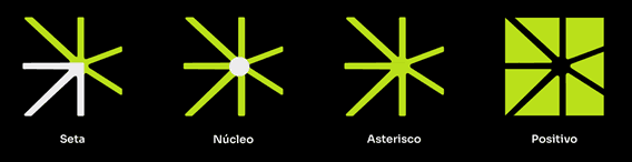
Logo Creation
The icons were developed and planned to communicate this integration with the real meaning of BitERP. The Asterisk symbolizes Artificial Intelligence, its assistant; the Arrow represents the ERP, its system with a precise direction; and the Core acts as the central point, unifying the entire platform.
The composition results in a brand that conveys technology and modernity.
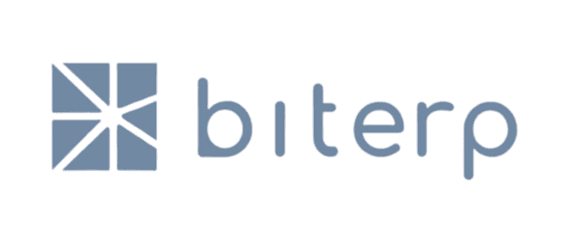
Variation 1
Its main version consists of an extensive typographic part, accompanied by the icon in the “Negative” form, being it directly an asterisk.
It also contains the separation of colors, where the highlight color is applied to emphasize the internal arrow of the iconographic logo, serving as a separation from the textual part inducing the correct reading of “BitERP”.

Variation 2
For more flexibility of use, there is the second form of the logo that can be used in different contexts. Following the inverse form created earlier, indicated in the image as “Positive”.
In this way, it preserves the asterisk, the arrow, and the separation of the words for the correct reading of the name BitERP. In this variation, there is its stacked form.

Variation 3
It is also possible to use only the icons indicating the representation of the brand, which can be used in headers, for example.

Usage Guidelines
For its proper use and preservation, it is necessary to follow the defined visual guidelines.
Incorrect
The color should not be altered, leaving the logo monochromatic, or any colors that deviate from the defined color palette.
Additionally, it should not be changed in a way that distorts the identity, nor should it deviate from the standard already used by the brand.

The structural form of the logo should not be altered, distorting the position of the elements and changing visibility in general.
Correct
Any color from the palette within the already defined variations can be used, maintaining the integrity of the brand, always combining the “arrow” with the “ERP”. The Square version of the logo should combine the internal color (symbol forming an asterisk) with the “ERP”.

Furthermore, the “Positive” icon should always be filled and never become a completely transparent image.
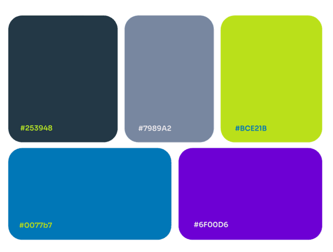
Color Palette
The colors were selected in a way that would evoke feelings of trust, modernity, and youthfulness. A high-contrast palette was developed for maximum legibility and visual impact, as well as being optimized for viewing on digital interfaces (Web).
This combination ensures that BitERP is perceived as a robust and serious solution, but also accessible and easy to use.
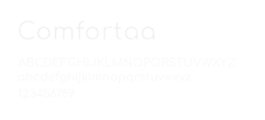
Typography
For the brand's tone of voice, we chose the Comfortaa type family to create communication that conveyed modernity, fluidity, and proximity to the audience. Ensuring clarity and legibility together with the contrast of the defined color palette.
Patterners
Patterns have been produced for use in graphic images, composing and reinforcing the message of the identity created.
In this way, the logo was designed to ensure its use was flexible, including different ways of using colors from pattern creations.
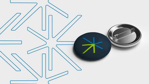
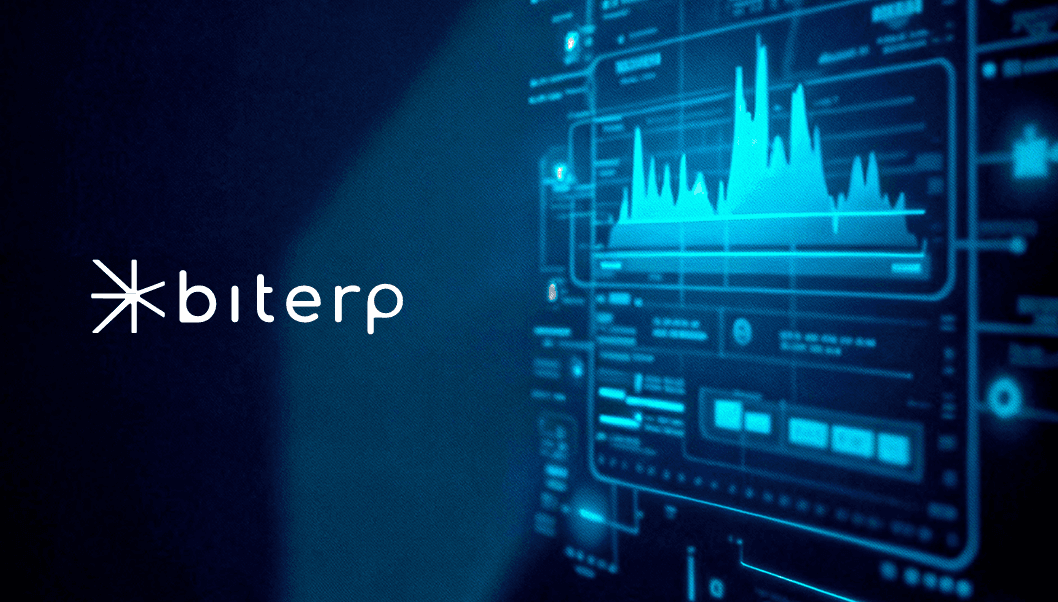
Image Usage
To maintain the proper use of the BitERP identity, images should be used with shades of gray, black, or white (not camera filters, but rather background colors or tonalities of the image), with simple backgrounds, such as the image demonstrated in “Patterners” to allow for stylization.
Moreover, the goal of images will always be to convey trust, technology, automation, and proximity to the audience.
For example, graphs, neural connections, pixels, squares, and computers.